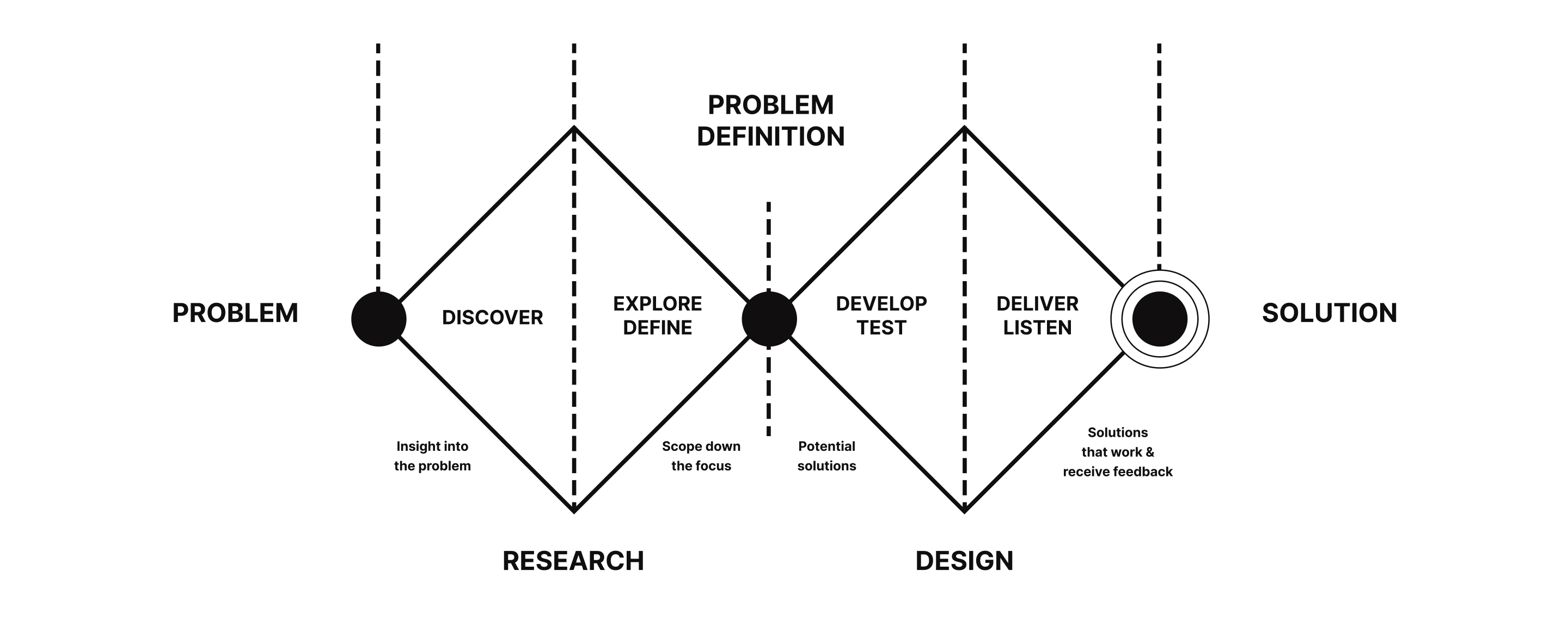
1. Context
Slack is a channel-based messaging platform designed to help people collaborate more effectively, integrate their tools and services, and quickly access the information they need—all within a secure, enterprise-grade environment. This case study identifies key pain points in Slack's usability and suggests improvements using the double diamond design process.
Slack platform.
2. User Feedback
The initial step involved a round of user interviews to pinpoint specific frustrations and expectations. Key pain points identified included:
- Difficulty finding specific information or recent conversations.
- Challenges managing multiple open channels, particularly in locating direct messages due to excessive scrolling.
- Some conversations appearing to “disappear” over time.
- Frustration when important files or messages get lost within conversations.
- Feeling overwhelmed and fatigued by lengthy messages.
- Dissatisfaction with the organization of conversations, with a desire for better grouping options.
Design process.
3. Going Beyond a Spreadsheet
A survey was also conducted to further explore usability issues, focusing on Slack's interface and workflow. It assessed reactions to a possible new contacts column and the features users find most valuable.
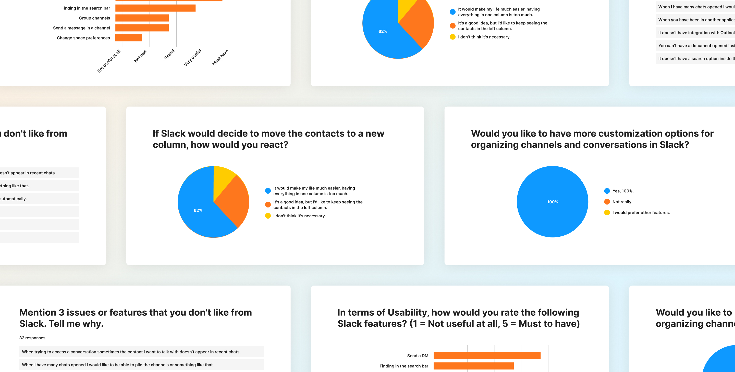
Results of usability test.
Survey results indicated several usability concerns. For example, 62% of respondents supported adding a new column for contacts, suggesting the current layout felt cluttered. Direct messaging and search were rated essential, emphasizing the importance of efficient communication and information retrieval.
4. Additional Research
I explored further by reviewing articles such as The Definitive Guide to Slack for Organizing and While Working from Home? 4 Tips for Staying Productive. These resources emphasized Slack’s role in increasing productivity, particularly in cases where users need quick responses or personalized video calls—both of which save time over traditional email.
Affinity Diagram & Benchmark
Using the data gathered, I developed an affinity diagram to map out key patterns and pain points. I also analyzed Slack’s competitors to see how they address similar issues.
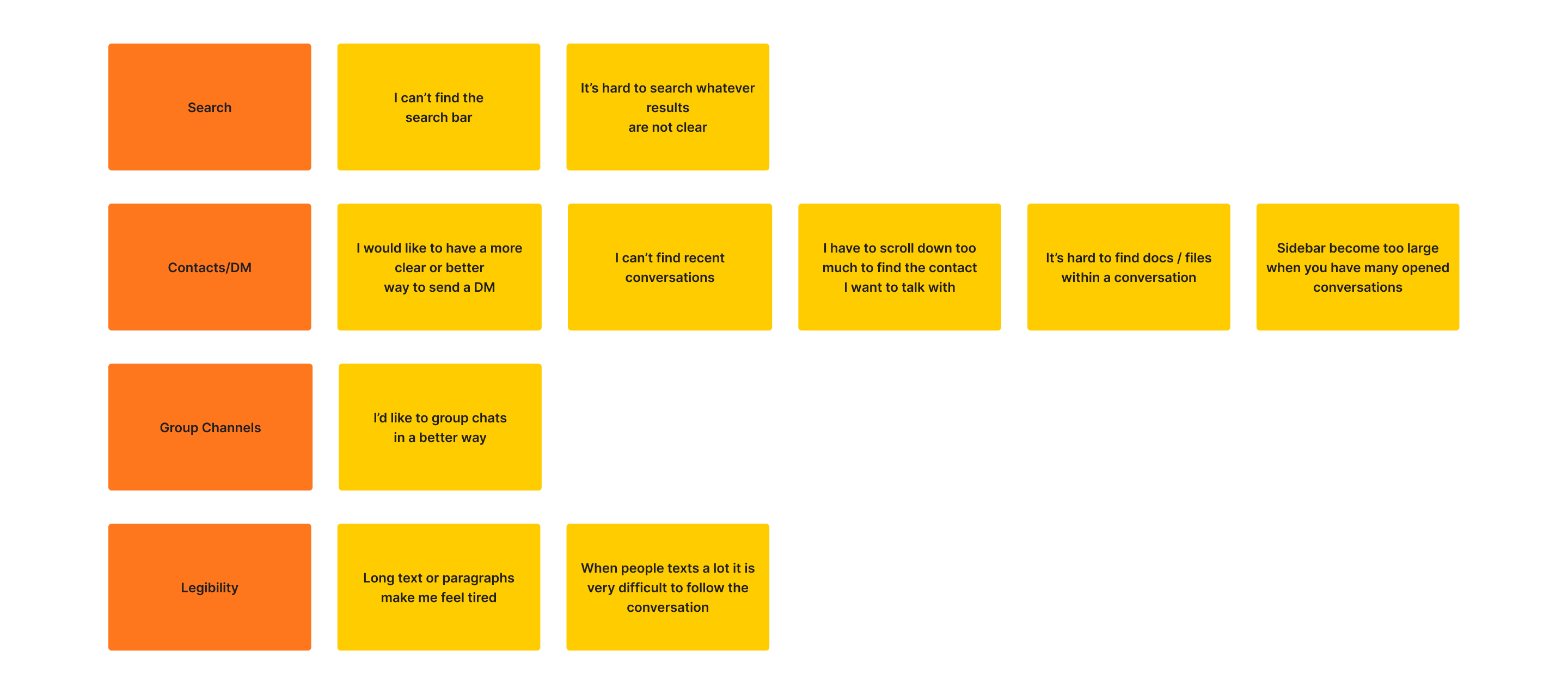
Affinity diagram.
Findings from the Benchmark
- Competitors commonly use multiple sidebars to better organize elements, sometimes up to five distinct sections.
- UI trends favor light colors, spacious layouts, and bold text for improved readability.
5. Approach
User feedback indicated difficulties with messaging and conversation retrieval. My approach was to introduce a new right sidebar for contacts, making it easier to send direct messages and organize group chats, while maintaining the core look and feel. Key principles included:
- Preserving the current design's aesthetics to avoid intrusiveness.
- Retaining all existing functionalities.
- Adopting familiar UI elements to ensure a seamless transition for users.
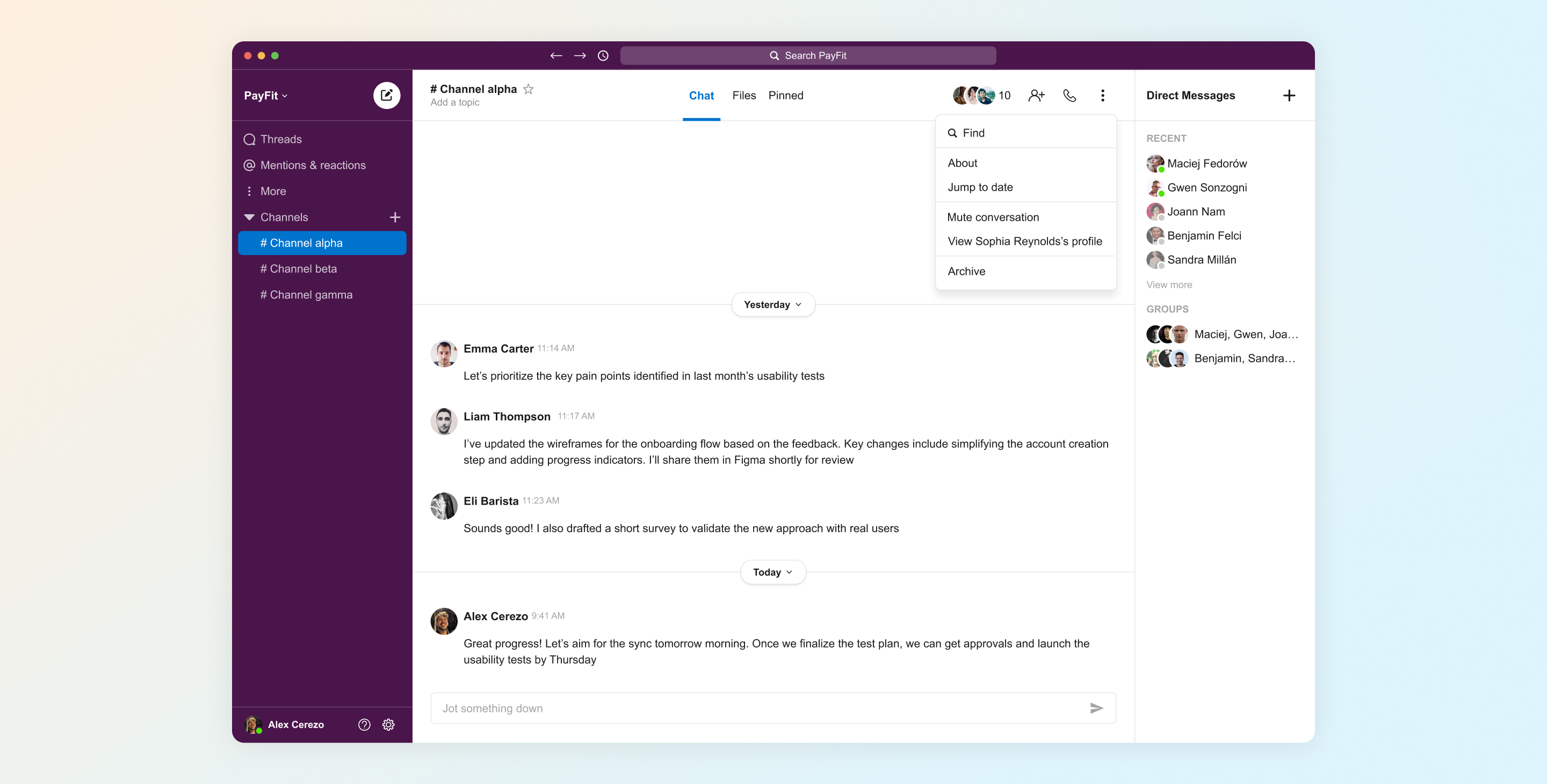
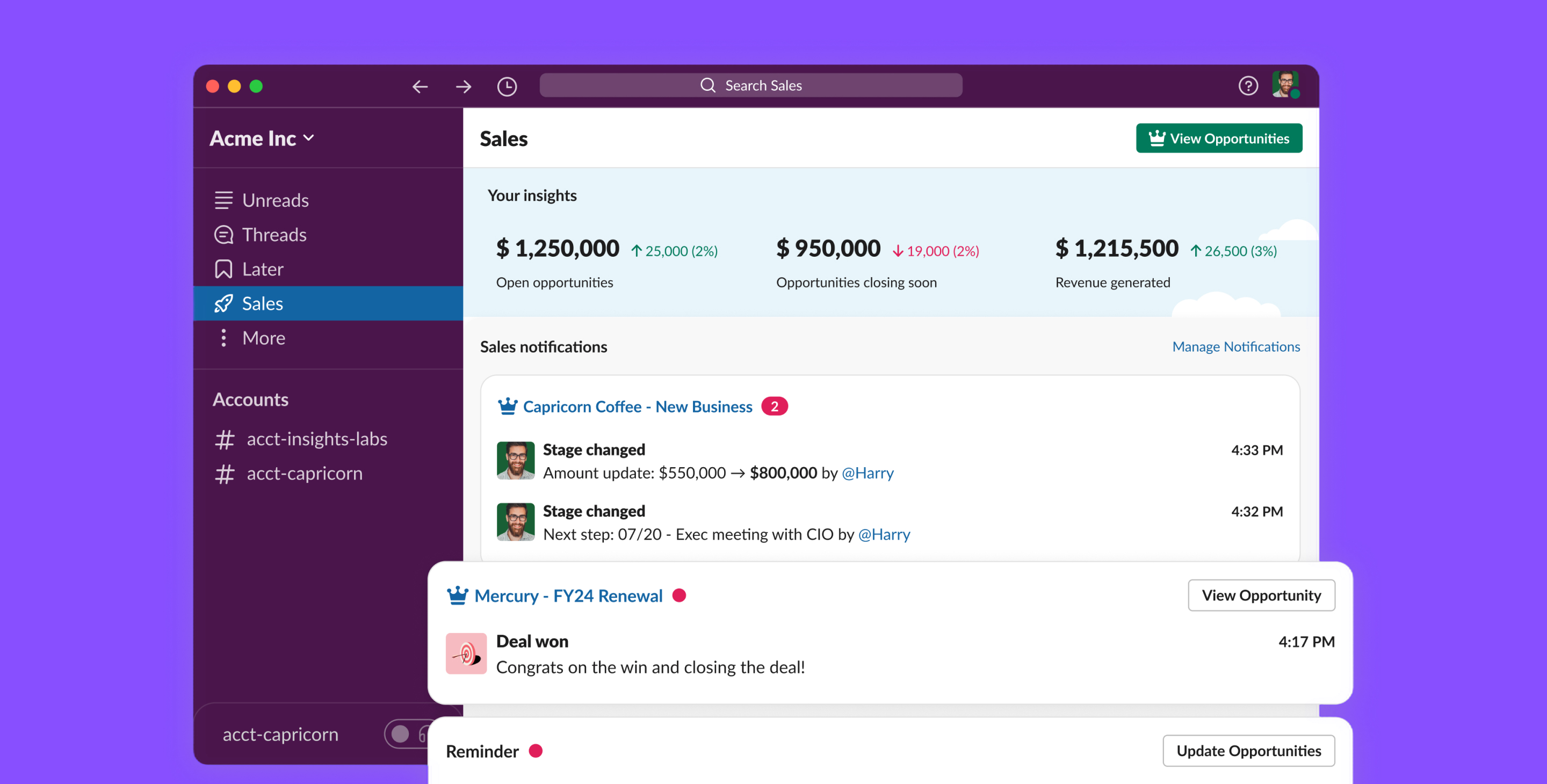
Direct messages.
6. Key Changes and Rationale
- New right sidebar: The new sidebar provides quick access to individual and group chats, reducing the cognitive load in the main sidebar.
- Chronological chat organization: Recent chats (top five) are shown, with a “View more” option for older conversations.
- Group chats section: Below “Recent,” users can find “Groups,” clearly separated for easy access.
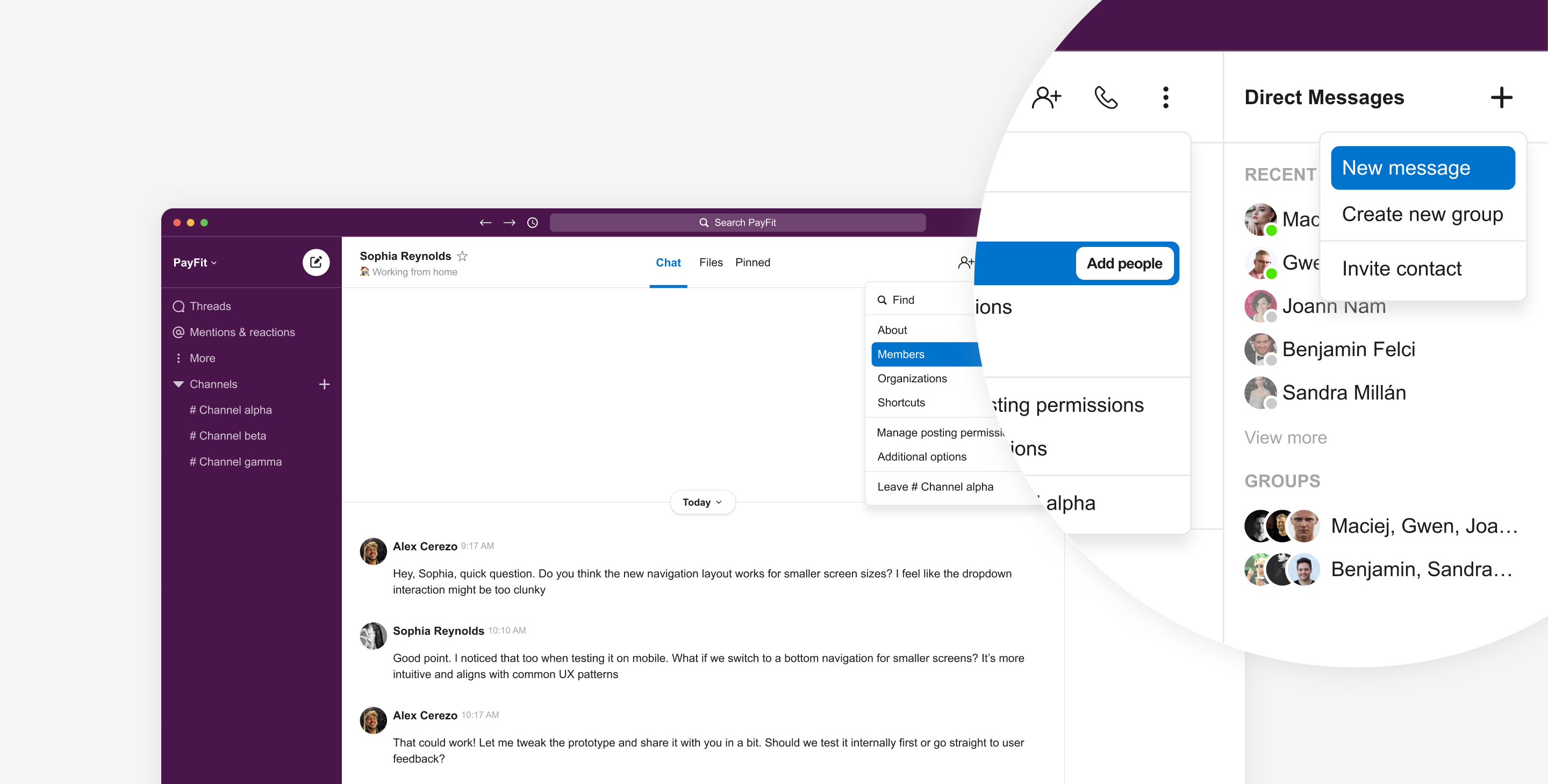
- Direct message actions: These are accessible via a dropdown from a “+” icon, streamlining common actions.
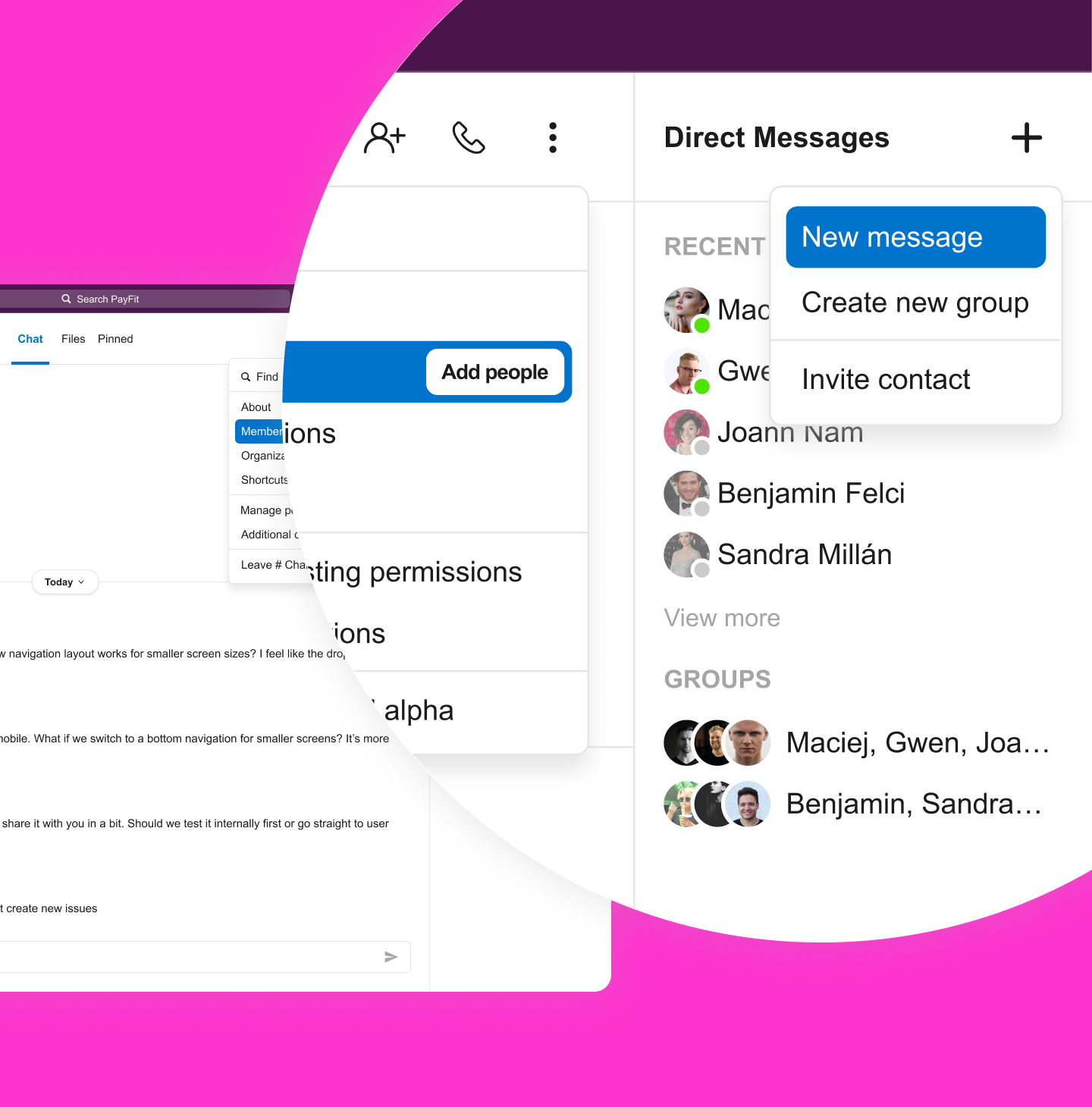
- Chat shortcuts: Important shortcuts are grouped in a new tab, allowing users to focus on active conversations.
- Menu-driven options: Additional options are accessible via the chat menu, with modal pop-ups for details—keeping with Slack's existing interaction design.
Actions by Type
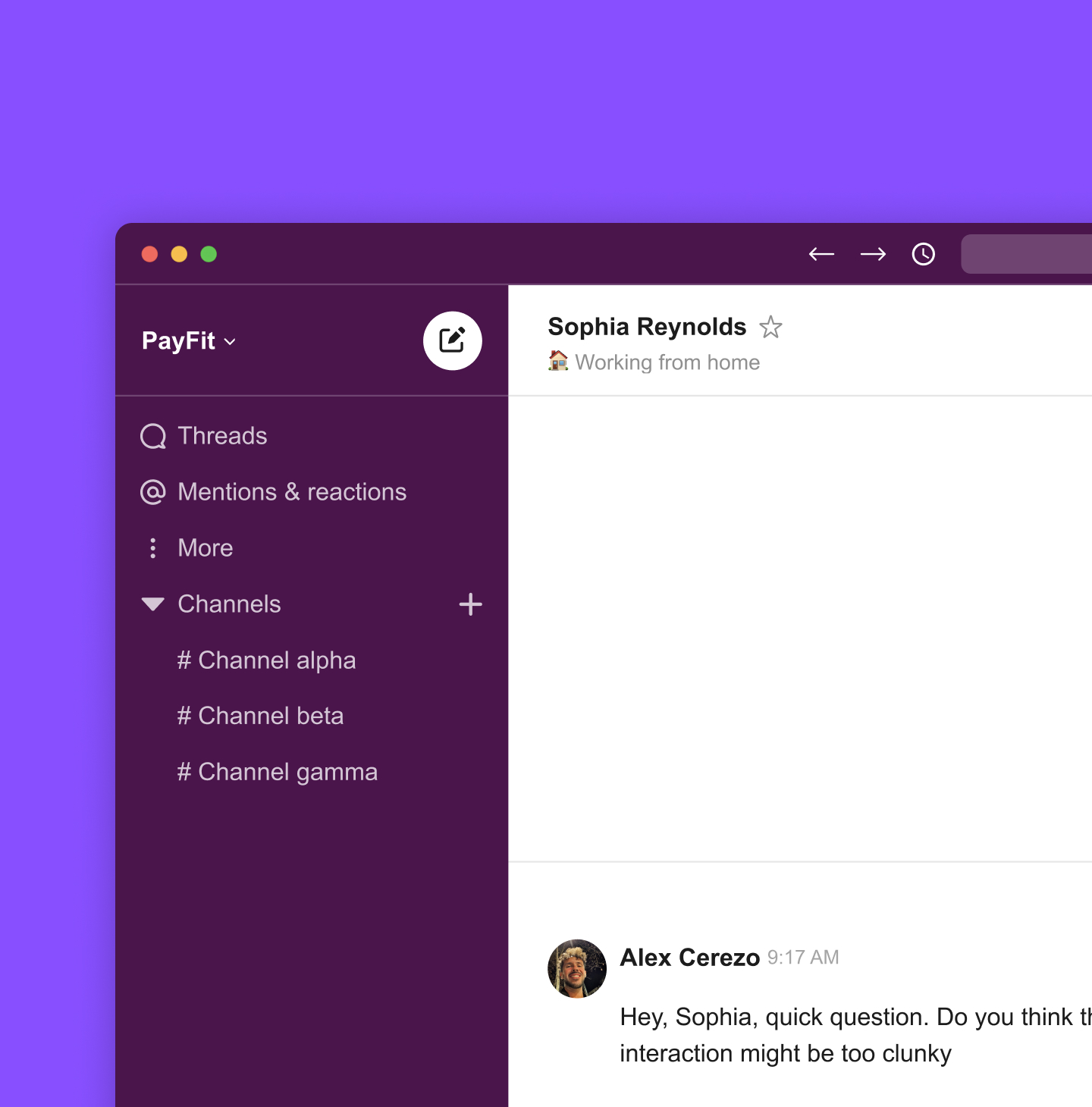
Access to certain actions varies by chat type. For example, channels display a participant count icon, and different actions are available in dropdowns. Profile, Settings, and Help have been moved to the bottom of the left sidebar, reducing visual load at the top.
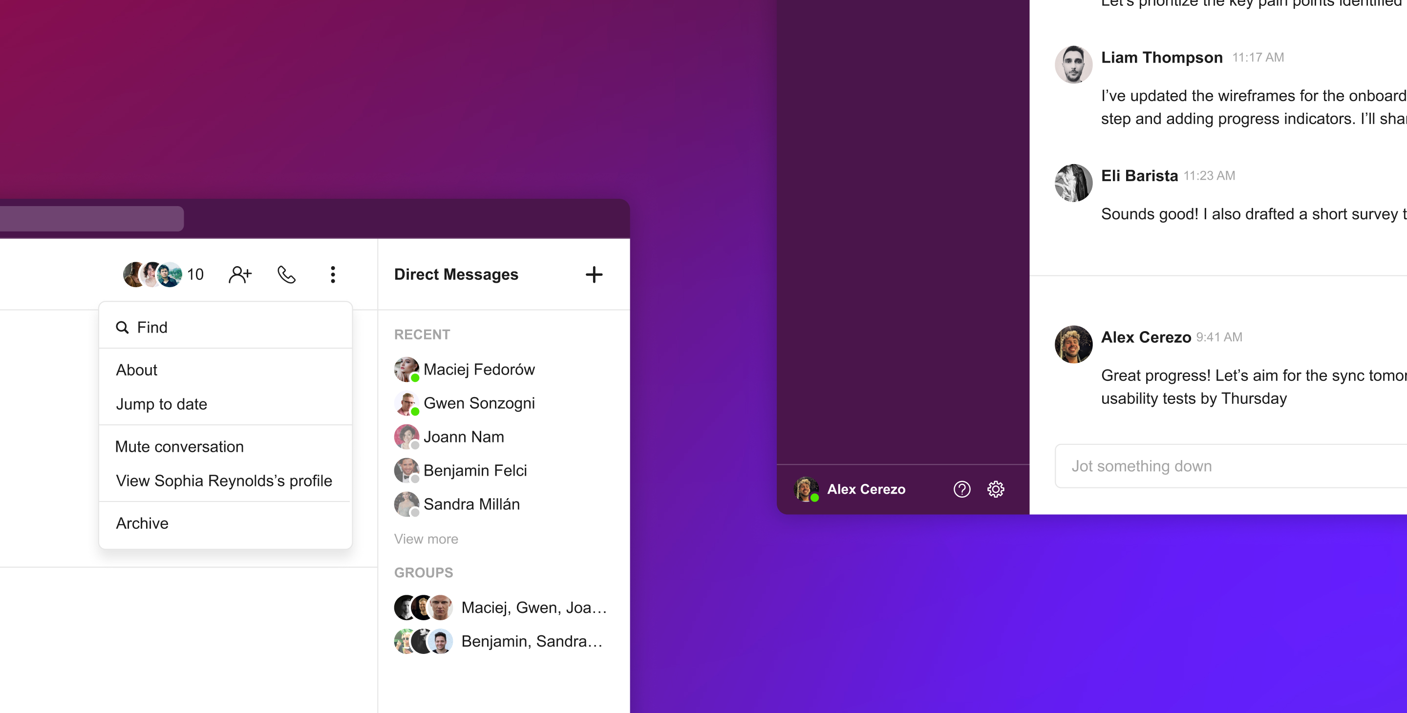
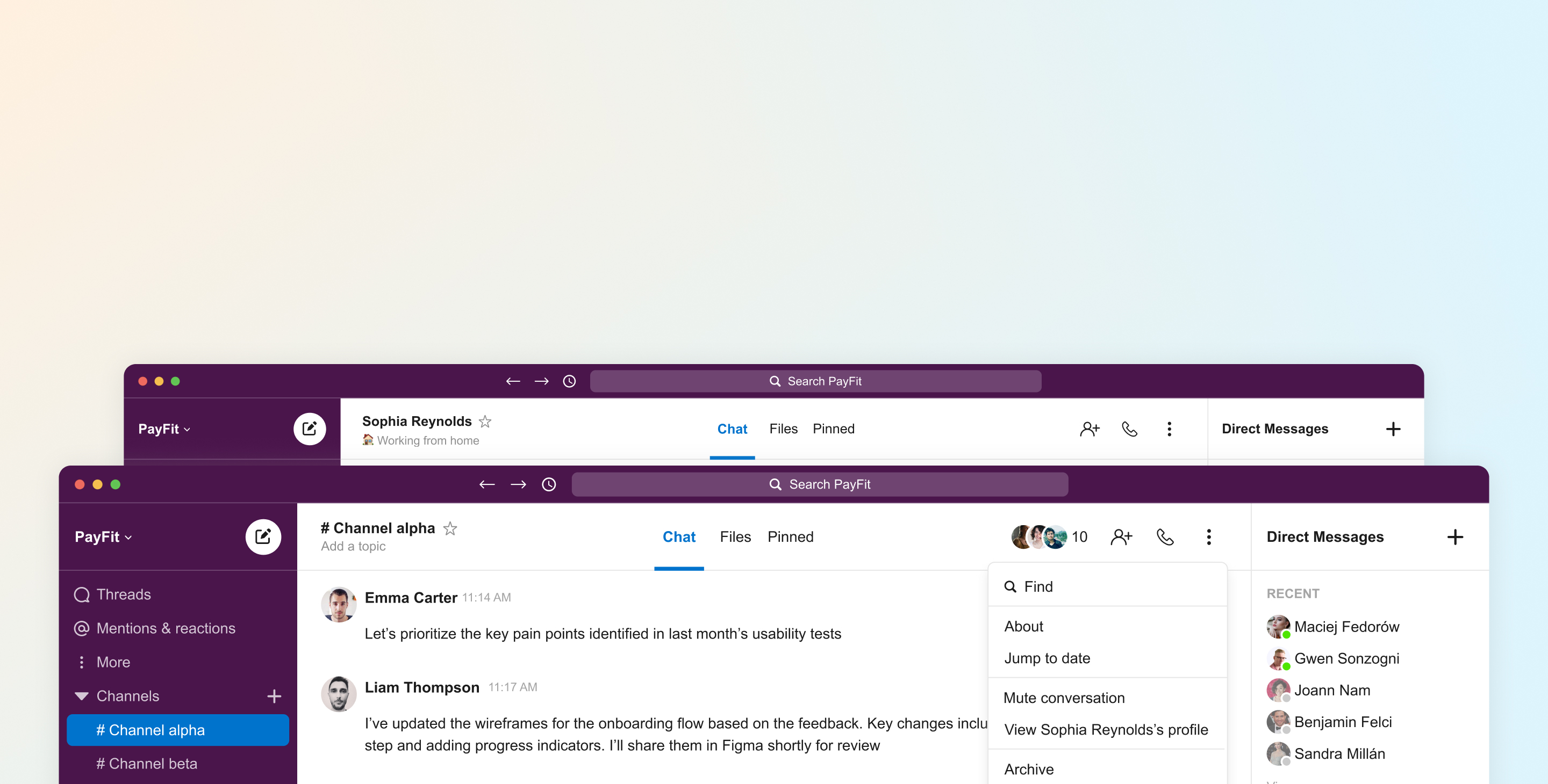
Chat shortcuts and actions by type.
7. Validation
Once the design was complete, I conducted usability testing with four participants who completed three tasks:
- Send a DM to Sophia.
- Create a group chat.
- Add a new member to a conversation.
All participants completed these tasks successfully.
8. Learnings
The research data highlights a clear trend: users are more time-conscious than ever. They value features that streamline tasks and improve workflow efficiency. Slack is actively working to meet Microsoft Teams’ level in this competitive space. I’m confident we’ll see major design advances in the coming months that align with these findings.